SGA
I loved being a part of the University of Kentucky's Student Government Association (SGA). It taught me a lot that I hadn't been exposed to in my engineering curriculum. However, our site was terrible. It was a wordpress site that suffered years of mismanagement and neglect. By the time I took over as Directory of Technology, the site was unusably slow and usually hacked. When SGA's advisor got an email from the dean of a college at a different university saying that our site was redirecting people to explicit content, I knew it was time for a groundup rebuild.


I wanted to address the root cause of the underlying problem: the people previously responsible for the
site weighed it down with plugins and widgets. Collaborating with the executive team, we decided that the
new site would have minimal features. No calendars, no image carousels, no blogs. We identified a number of
use cases and derived our features from there.
Students rely on SGA for a lot of resources, some they don't even realize we have!
I think the most common resource is funding. SGA gives a lot of money to on campus orgs
and the process can be pretty confusing. We wanted to clearly lay out the process and types
of funding we have.
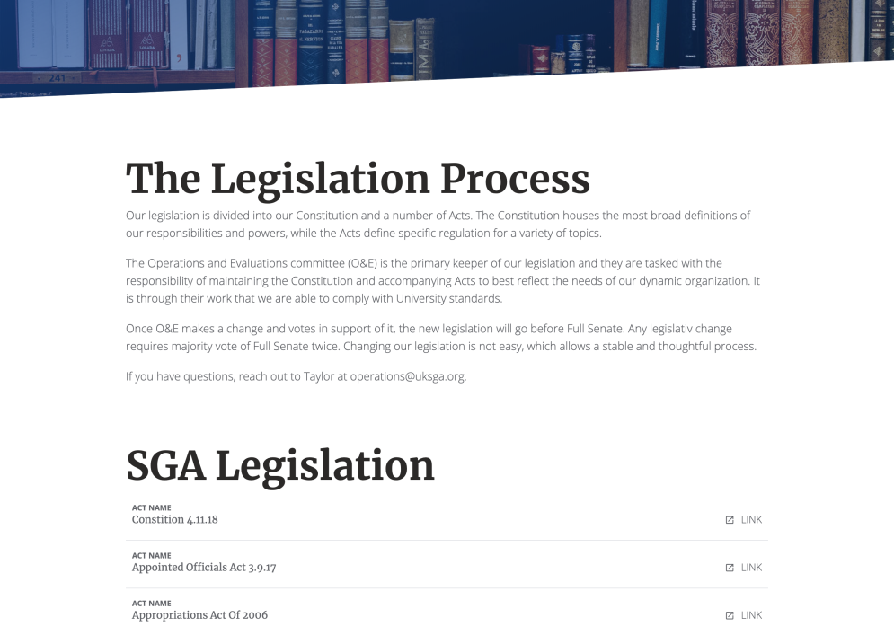
Since our legislation outlines the ways to be elected and run a campaign
as well as how to receive funding from SGA, we needed to make all of
those resources easily accessible. We built the Legislation page and a
way admins can upload new versions of legislation from a custom CMS.
Students generally didn't know all of the services we provide, many
of which are super useful. We wanted a way to showcase them
and provide ways for students to get in touch with the people
that run them.


Students vote for their representation every spring. When things
come up that affect students, they want to be able to get in
contact with the people that can fix the issues. We created
profiles complete with headshots, position titles, and
contact information for everybody in SGA.
You can find these under the Branches tab.
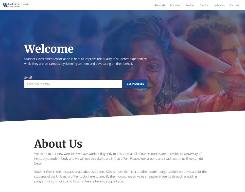
We wanted students to feel like they were able to join our
organization, so we needed a way to collect emails from
curious visitors. We put the email form directly on the home
page so it was impossible to miss.
The site took the majority of a semester to build. We used Symfony and created a CMS, accessible for non-technical admins, that could easily manage all of the content on the site.
The feedback was immediate and kind. We collected dozens of emails and got more people involved than we had before. Students use the site to get information on our services. People have downloaded meeting minutes and legislation. Administrators were thrilled. It was a big win. Currently the site is maintained by Hayden Free, who is doing a fantastic job.
